I. The Myth
It goes back before COVID forced city dwellers to seek greener pastures. It goes back before white flight. It goes back to the founding of the United States, and the ideological struggle at its heart. It even goes as far back as the evolution of man, from hunter to farmer. It’s a feature of humanity seemingly as deeply-rooted as speaking or tool-making, and which, I believe, is now a Sphinx. I’m talking about the myth of the Urban-Rural Divide.
First: Why is it a myth? Simple: Because it no longer describes our reality. Instead, it’s a fossilized description of a past which continues to dictate our present. We see it everywhere and we have come to accept it without thinking twice. That alone is reason enough to give it closer scrutiny.
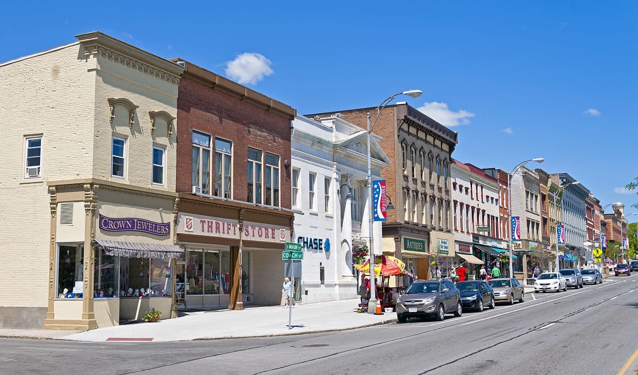
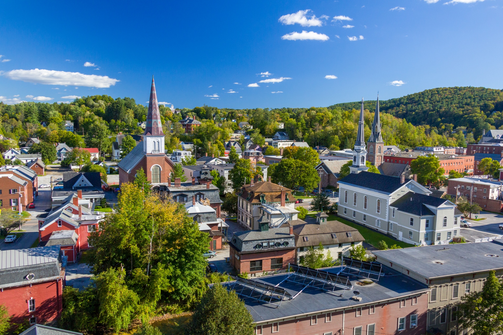
Do an image search of “urban rural” online and you’re bound to find lots of images like this one, which, let’s admit it, matches exactly the image you were expecting to find:

The message couldn’t be clearer. There are but two ways of living in this country: in a metropolis or on a farm. Like many other notions of who we are, this duality has so embedded itself in our consciousness that it not only becomes impossible to sort our lifestyles into anything but these two categories, it also self-perpetuates. Conveniently (in ways I will shortly explain), American politics has bought into the duality, so much so that national electoral maps and actual election results visualize the phenomenon better than any data scientist. It’s evidence that we follow our own crumb trail. Furthermore, anyone who attempts to pick at the seams of these myths is dismissed as a deviant churl. So let me be the deviant churl for a moment.

Though it may be true for some of us, many of us do not associate our neighborhoods or lifestyles with either of the two pictures at the top of this post. Many of us are likely somewhere in between. Or, perhaps, many of us are living something close to either image but for one or two important differences. My goal here, then, is not to debunk but to redefine. Let’s break it down.
Disclaimer: At the end of the day, an analysis of this type means looking at the entire nationscape– all 105 trillion square feet of it– as a spectrum composed of many variables. To my frustration, a prosaic and unassailable hurdle prevents me from performing it: computation power. I simply do not have the storage or software know-how to produce meaningful visualizations. Furthermore, Census data (and most data in general) is naturally biased toward more densely-populated areas, since more people equates to more data points. And non-Census data is harder to dig up, which I don’t have the time for. Thus I have kept things high-level and sketchy, looking no deeper than US Counties, if for no other reason than to limn the contours and show the framework’s potential.
II. Criteria
What do urban and rural actually mean? Going beyond “metropolis” and “farm,” these terms typically boil down to population, specifically population density. Officially, according to the United States Census Bureau, an “urbanized area comprises any consolidated administrative area of at least 50,000 people.” Colloquially, this makes sense, but only from 10,000 feet. There are densely populated areas that you wouldn’t consider “urban” (Hialeah, FL: pop. >230,000 but a sprawltastic suburb), and vice versa (Montpelier, VT: pop. <8,000 but a state capital home to Vermont’s judiciary & legislature). Clearly there’s more to it. If you remember from World History class in middle school, “civilization” is defined by population growth but also by things like written language and labor specialization. Likewise, any settlement should be defined not just by the the amount of people that live there, but also by things like economic activity, land use, transportation, laws, and culture. A change in any of these constituent elements should warrant a change in classification.

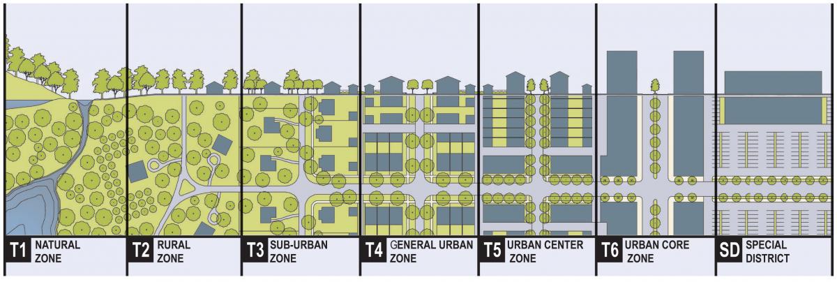
New Urbanism, the planning movement of recent decades defined by walkable, tight-knit communities, has championed a nuanced understanding of the lands on which we live, most notably the Transect made famous by the Center for Applied Transect Studies (headed by Andrés Duany). The online collection of transect types is comprehensive and illustrative, but it still uses “urban” as its baseline term of art, and population density as its only meaningful measuring stick.
The United Nations has come upon this similar problem of defining “urban” in Table 1 of this Methodology Report of the 2018 World Urbanization Prospects. Some countries used only one criterion to determine urbanization, some used a combination of two or more. However, at least this report observes the presence of four variables in determining the characteristics of a settlement: administrative (borders), economic (quantity and quality of goods & services), population size/density, and urban characteristics (infrastructure such as paved streets, utilities). We can look at these four in greater detail, and I believe I may add one or two for consideration in describing more settlement types beyond urban and rural.

A shoutout here is due to Dante Chinni’s American Communities Project (ACP), which has come awfully close to the kind of redefinition and detailed description I’m talking about. Its main distinguishing feature is a strong focus on demographics: ethnicity, religion, education, et cetera. My hypothesis is to introduce more variables related to the built and natural environments, which in my mind are slower to change, and therefore more consistent descriptors of a particular place. And finally, though this is looking further ahead, while the demographically-oriented ACP is useful for things like political analysis, my study may be more useful for things like economic policy or infrastructure investment. Let’s see if it gets that far.
So what are the natural and built environment variables I want to bring into the mix?
III: Borders
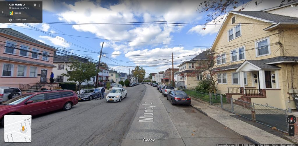
Administrative borders, while they are useful for government entities, actually hold us back. Sometimes geographic features like rivers make the extent of an area starkly clear, but in most cases a commuter looking out the window experiences more of a gradient as houses become gas stations become factories become office buildings. Standing on Mundy Lane, at the border of NYC and Westchester, the only hint of the administrative border is the roadbed: the NYC half is paved with concrete, the Westchester half with asphalt.
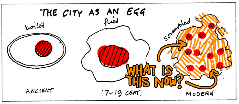
Anyone familiar with the term megalopolis might already intuit that there is a spectrum rather than a binary, and that even dense urban centers are no longer the reference point for one end of that spectrum (like they may have been since the term urbanization was invented by Ildefons Cerdá in the mid-1800s). Sometimes planners refer to Cedric Price’s City-As-An-Egg diagram to describe how cities went from walled-in medieval towns to centralized modern cities to sprawling networks. This last “scrambled” stage is where the classic city center supposedly dissolves into multiple smaller centers, each specializing to a degree in some productive activity (more on that later), with no single node able to claim superiority over any other. Crucially also, the interstitial space is no longer an afterthought because it is the adhesive that binds the nodes together. It cannot be homogeneously described (or dismissed) as undisturbed wilderness or rural farmland or even tidy suburb. Just like the varied ways we have to describe city centers, the adhesive medium needs an enriched vocabulary beyond “rural.”
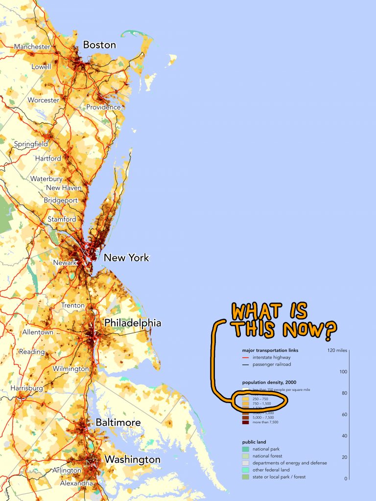
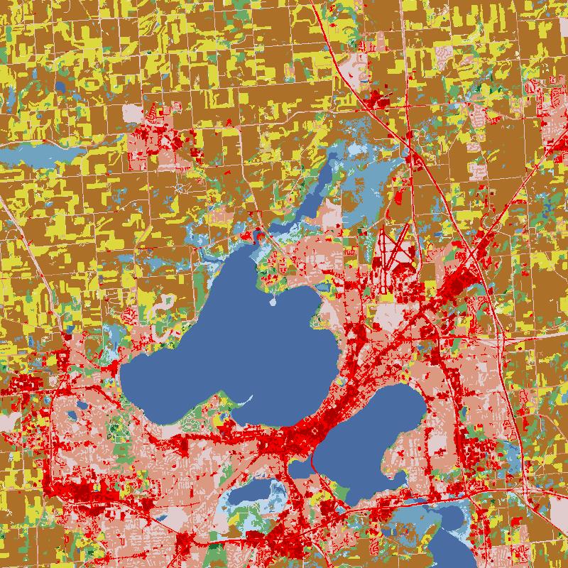
While this is still mostly a model, there are real-life examples that demonstrate this kind of networking, the Northeast US Boston-Washington Corridor being closest to home (see map below). What interests me are the yellow-orange zones in between the big cities. They represent population densities between 250 and 1,500 people per square mile. That’s quite a range.
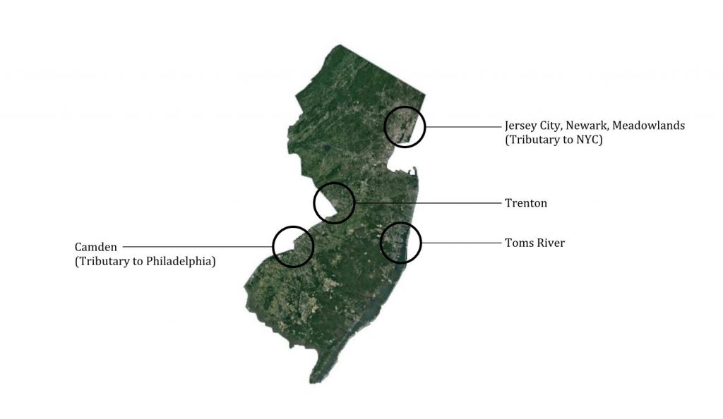
The separation encouraged by borders also obscures the fact that different areas are interdependent and share history. New Yorkers love to crap on New Jersey, but they forget that their image of New Jersey– the smelly, industrial, post-apocalyptic expanse of the Meadowlands in Newark Bay– is in fact industrial sprawl from New York itself. Those factories, shipping terminals, and landfills are doing work in support of Manhattan’s business center. Even though the rest of Jersey is green, this onceuponatime wetland single-handedly tarnishes the state’s image.

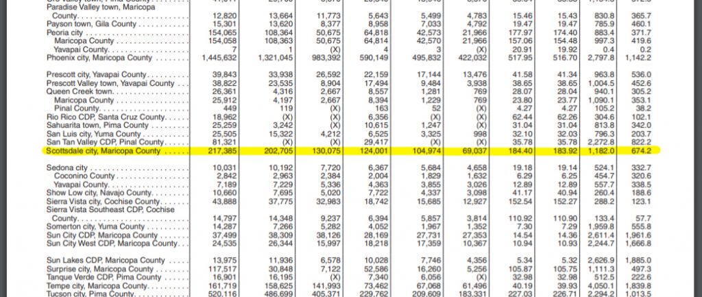
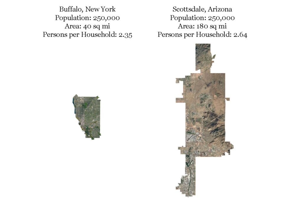
V: Population
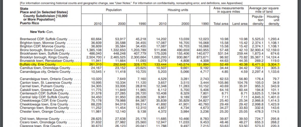
Breaking population down by density helps to flesh out the differences between sprawling cities like Scottsdale, Arizona and post-industrial ones like Buffalo, New York: both have similar populations (about 250,000), but cover wildly different square mileage (Scottsdale: 180+, Buffalo: ~40). The Census looks at also looks at factors like persons per household, which is the difference between a Lexington, Virginia (2.07) and an El Paso, Texas (3.13). Is this area family-friendly, or more for singles?
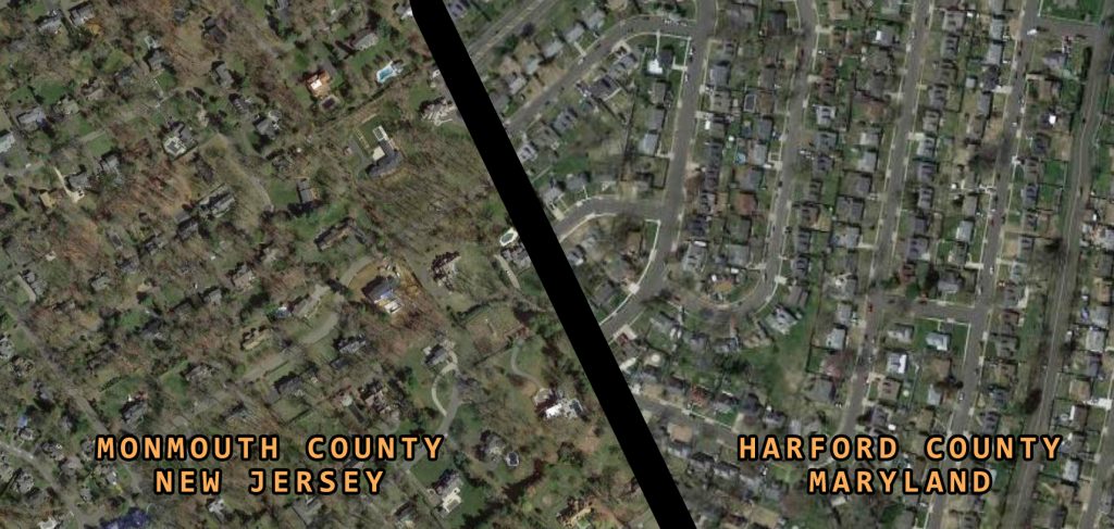
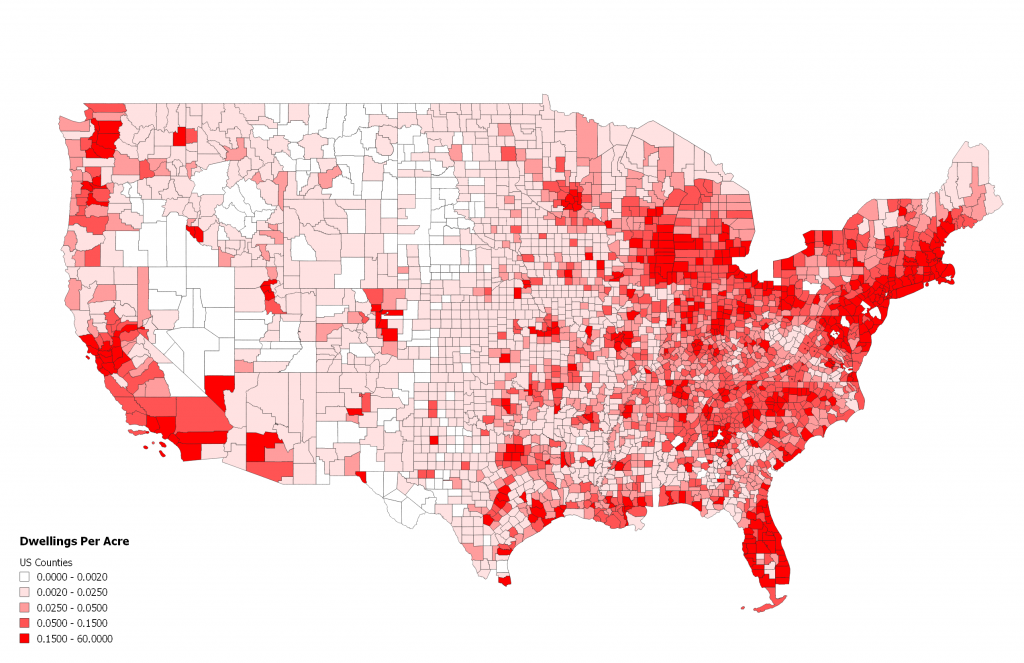
To describe the scrambled egg interstice a little more qualitatively, let’s translate people per square mile into dwelling units per acre. This helps give us a sense of the built environment, but also may spring some surprises. In my study I subdivided by counties. Looking at the map of the Northeast Megalopolis again: Harford County beyond the northeast border of Baltimore has a population density of 600 people per square mile and 3.69 dwellings per acre (population 260,924; land area 437 sq mi / 27,520 acres; housing units 101,600), whereas Monmouth County on the Jersey Shore has 1,320 people per square mile and 0.88 dwellings per acre (population 618,381; land area 468.79 sq mi / 300,000 acres; housing units 262,925). Denser population doesn’t necessarily correlate to denser development; while both of these counties are defined by the typical trappings of suburban America, one may have more protected natural lands, larger lots, less robust roads and infrastructure, etc. making the flavors of suburbia noticeably different. Notice, however, that what we would typically call suburbs encompass a broad range of housing units per acre: all the way from 1 to 4. I find dwelling density to be an elegant metric that nicks population and built environment with one stone.
IV: Land Use, Economy
The Meadowlands instantiate the consideration of areas that are tributary or peripheral to the dense urban centers of our imagination. They are important to consider not only because they fall outside of the administrative borders of that center but also because often they specialize in a certain land use or economic activity which the center could not hold (and without which the center could not hold). Manhattan and its streamlined cosmopolitanism wouldn’t be possible without the shipping, power generation, or automotive warehouses turning the engine just across the river. Further into the 21st century, the Meadowlands may also become defined by environmental industry: dikes, hydro plants, wind generators, oyster farms, biogas landfills, etc. In short, we should consider a given area’s relationship to the land, especially regarding its economic output and environmental exposure.
The Census collects data on employment in various industries, sorted by codes assigned by the North American Industry Classification System (NAICS).
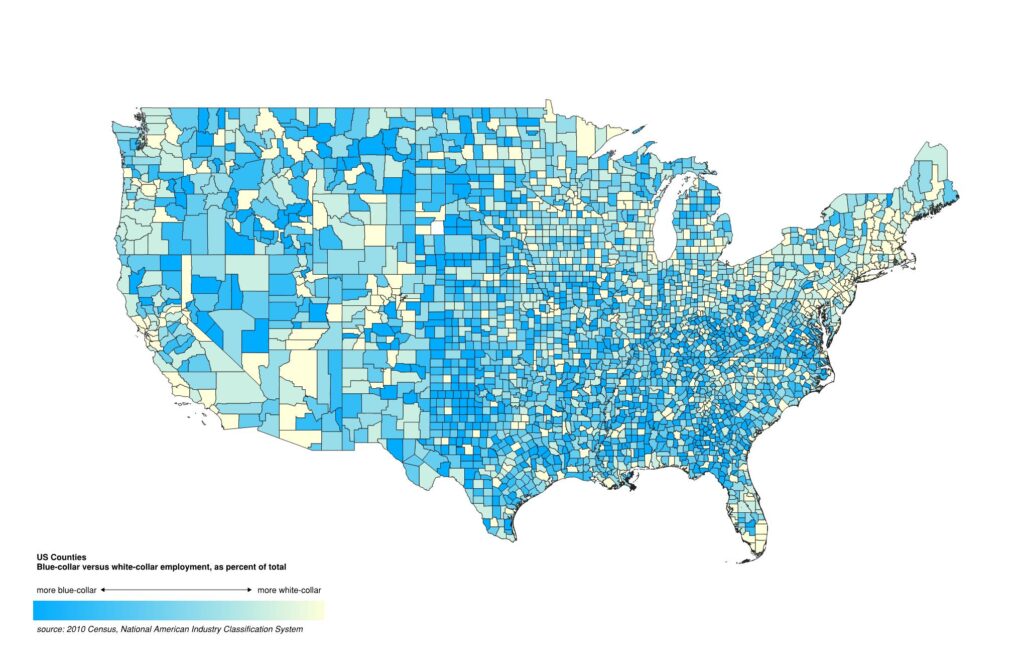
The specific dimension of the urban-rural myth to kill here is the notion of progress, of humankind constantly advancing to perfection, that white-collar, screenbound activities (NAICS 51, 52, 53, 54, etc) are superior to agricultural or warehousing ones (NAICS 11, 21, 22, 23, etc). It’s dangerous because it clears the path for all sorts of ethnological biases, wherein one group perceives another group to be “behind in the race.” And while your garden variety bias of that sort is usually built on the basis of race, the urban-rural myth permits it to be built on the basis of occupation as well. In fact, it is untrue. We humans are still earthbound, and we still depend on and use the land in ways which in the year 2020 might seem ludicrously outdated, such as how we make beer, catch fish, or obtain fuel for heat. The reality is that we all still embody an ancient way of living off the land, and so we shouldn’t look upon those who perform that work to be uncivilized. Similarly, we shouldn’t look upon natural wilderness with paternalism like in the 18th and 19th centuries: these areas are not virgin lands to be protected. Rather, the organisms there are playing a very active role in supporting our way of life. We will ultimately conclude that these areas are worth preserving, yes, but the difference is one of perspective: look upon the mountains, forests, and deserts as active players instead of as ossified time capsules.
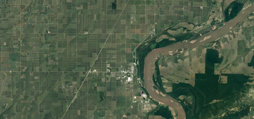
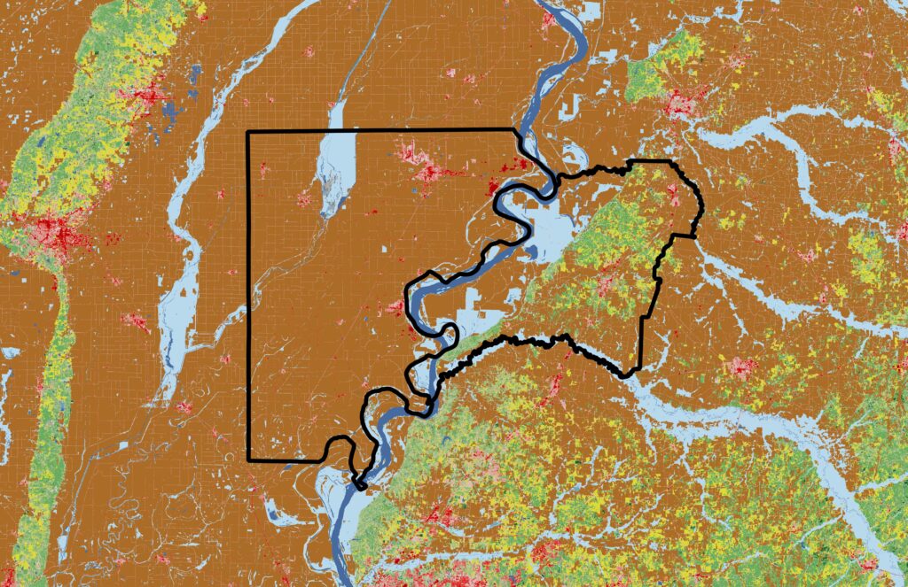
Have a look above at this section of the Mississippi River between Arkansas and Tennessee. Orthogonal farmsteads in Mississippi County, AR on the western side and nature preserves in Lauderdale County, TN on the eastern side are both deeply connected to the river, population densities (and hence administrative borders) are similar, but the relationship to the land is different.
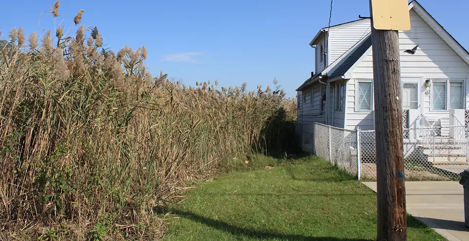
Now’s a good chance to broach the binary with the obvious enfant terrible of land use: suburbs. Low-density automobile-oriented districts specializing in middle-class housing have been part of the American landscape since as early as the 1800s when Brooklyn Heights saw its first big influx of residents in the wake of the… wait for it… yellow fever and cholera epidemics between 1793 and 1825. But despite their perceived insularity they exist in deep connection to dense commercial centers within commuting distance. The classic sprawling suburbs are but one example of a satellite area which provides living space for city workers (if history rhymes, might COVID-19 spawn a “new suburb” where city-dwellers fleeing high rents stay full-time while working remotely? Houses and streets will look different). There are other in-between area types like strip malls. These are commercial and consumption-driven zones (expect to see high employment in Wholesale Trade, Retail Trade, Real Estate Rental & Leasing under NAICS) which in their turn are dependent on nearby single-family residential zones with cars. The goods sold in those shops come from factories which are often mini-nodes in their own right, germinating into towns after attracting enough workers. But the raw materials (produce, lumber, ore) processed by those factories are brought from elsewhere still (farmland, forests, mines). Interdependence, if not a criterion, is a reminder of the ecosystemic way we live. Main Street mainstays depend on tourists for money. Yuppies depend on rednecks for produce. Suburbanites depend on bigwigs for legislation. White collar depends on blue collar for car parts, blue collar on white collar for engineering. Administrative borders aside, what is a place’s unique mixture of housing, commerce, industry, culture, agriculture, government, parks or natural preserves, etc.?

Parenthetically, a place can transform over time from one category to another. Marfa, once a railroad station, is now a cultural destination. Fremont, once a colonial mission, is now home to a Tesla factory employing 10,000 people. On the flip side, Detroit, once a boom automotive town, has languished in no man’s land since the 2007-08 Recession. Another factor is climate change, which is increasingly affecting land use decisions in a very concrete way. This has been true throughout history. Phenomena which once changed Mexico City from a marshy lake to a sinking metropolis within 200 years will now happen within 50, 25, or 10. Miami-Dade County, home to 2.7 million people, is at great risk of going underwater as sea level rises, prompting a total recalibration within the insurance business, and billions of dollars of resilience programs to be launched. Increased frequency of destructive wildfires in California have led to the classification of a special zone, called the Wildland Urban Interface (WUI), to help fire departments and residents confront future blazes.
/cdn.vox-cdn.com/uploads/chorus_image/image/51442481/IMG_4339.0.jpg)
VI: Mobility
This is something the UN reference neglects, and which I think is vitally important: how is the population that we just described two sections ago getting around? Transport of people and goods over long distances, I would bet money, will remain a necessary organ of civilization forever, and the amount of real estate occupied by transport infrastructure is often greatly impactful. Car culture penetrates low-density (Arlington, Detroit, Phoenix) and high-density (Cambridge, Jersey City, LA County) alike, rail systems in cities and commuter rails in towns (the name “commuter rail” neatly defines the town’s symbiosis with the city), carpooling, buses or passenger vans (a more specialized or informal bus system, in places where senior citizens or schoolchildren need to get around), bicycles (and whether they get their own pathways), planes & airports (Minneapolis / St. Paul International Airport sees roughly 100,000 passengers a day, which is a quarter of the city’s population), boats & harbors (Miami, Seattle, New Orleans, New Bedford, Galveston). The latter two, you could say, spill over into my Land Use category: an immediate area’s entire economy grows around an airport or a harbor. A well-lubricated transportation infrastructure allows for many of the above criteria to develop as well. To to identify any place’s favorite mode of transportation is to identify something fundamental.

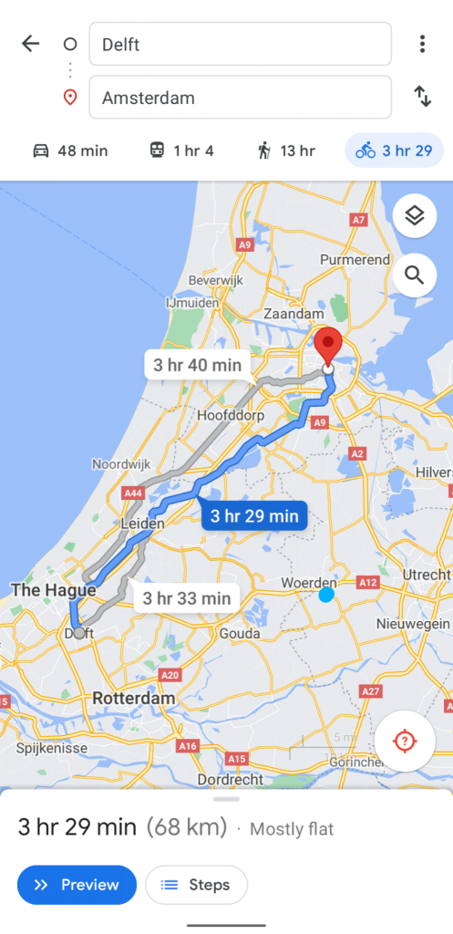
However, it hardly needs to be said that The United States is by-and-large a country dominated by private automobiles. Thus, this dimension of the analysis would have to creatively contort some in order to produce any meaningful difference from one place to the next, at least to the degree I aspire to. Spreading the analysis to other countries might flesh differences out much more obviously without needing to modify the method. Case in point: I once dreamt of taking a trip to the Netherlands, and spent some time exploring it on Google Maps. When I wanted to see how far it was from Delft to Amsterdam, I entered the two cities into the Directions panel, and the algorithm automatically gave me the trip by bicycle.
V: Laws
This may be much harder to articulate and point examples to, but the presence and quality of local building laws is both an indicator of and a target of the sentiment of a settlement toward its land use aspirations. This may sound like me trying to make something out of nothing, but the mutable nature of all laws should reflect the way the citizenry (or, if you’re cynical, big money in politics) currently feel about how their land should be used.
Take something like The 1811 Commissioner’s Plan for New York City (great minds choose the same WordPress themes, Bowery Boys), the one that laid out the famous grid that remains to this day. At the time it reflected dominance over nature, and the desperate need to expand the small city into the wilderness and relieve congestion in the tip of Manhattan island. Another example, much more recent, is The Minneapolis 2040 Plan, which effectively abolished single-family zoning and paved the way for increased housing capacity in a growing city. This signals the intent for Minnesota’s most populous area to grow from a metropolis into something more dense and inclusive. What will these “tier 2” cities become in the 21st century?
One must also account for the other end of the regulatory spectrum, and I wouldn’t consider this analysis thorough without mentioning Houston, TX, a city without a formalized zoning code at all. That an area can grow from a speculative land grab on a riverbank to the 4th most populous city in the US with only a handful of public space regulations speaks to the broader range of lifestyles we can all live as individuals, even within the cooperative borders of a city. Houston boasts an eclectic collection of street grids, sub-par pedestrian experience (though this has lately advanced in Planning Department agendas), and low-density sprawl. For this reason it, more than most other major American cities, may contain the broadest variety of zone types (which I aspire one day to propose).

VI: Services
Going even more granular, we can quantify how many supermarkets, hospitals, or hardware stores are located within any given area. We’ve all heard of food deserts. What does dwelling density matter if the people that live and work there are unable to find groceries or seek medical care? Critically, this will help distinguish categories within big metro areas, though at the moment my first-pass analysis only looked at the county level, so this will have to remain on the wish list.
VII: Looking at the Data
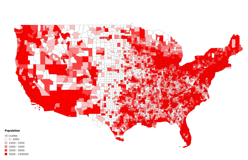
In data visualization terms, my hypothesis anticipates that placing all the individual study areas on a chart will not show a stark divide between the red ones and the blue ones, but will instead show “clustering,” indicating a handful of common ratios between my chosen characteristics, and therefore a handful of area “flavors” that exist out there.

How do we coalesce these variables into a proper model? Why not just build on what’s already been done? Take the Urban Transect again. Like I mentioned, its descriptiveness is limited because it’s literally one-dimensional. In mapping terms, this would be the equivalent of looking at each county’s population (a flat number, since people are indivisible).
Why don’t we add an axis by showing a number that is derivative, or “something per something,” such as population density or household size?
This is a fairly well-gradated distribution, the relationship between population and housing density is direct. Dense clustering can be seen in the middle of the scatter. The typical US county has 10,000-50,000 residents, with about 2.5 people per household. Notice a subtle “tapering” happening toward the right of the chart, where higher populations correlate with less spread in household size. Los Angeles, Houston, Chicago, and Phoenix have a household size between 2.6 and 3.
Now that we see that population and housing are correlated, we can combine them into one axis and add another, say jobs diversity (as calculated using Shannon’s Diversity Index). Each county can also be colored using the aforeshown “White Collar Index.”
Here the correlations start to break down a bit. For example, there are different shades of blue all over the chart, indicating that denser areas do not necessarily correspond to more white-collar jobs. We can see a hint of clustering in the upper right, at about 1 house per square kilometer and a 0.9 jobs diversity index (including in it Fulton County, GA, Dallas County, TX, and Seminole County, FL). Also interesting to note is the peculiar “drippy” shape of this chart, showing a number of counties with low jobs diversity (such as Alpine County, CA which seems to have most of its jobs in the arts and hospitality, a very specialized economy indeed) across the whole spectrum of housing densities.
Let’s go one further, adding depth by factoring in mobility. I measured mobility by adding up the total length of roads & rails inside each county.
Although I was hoping to see more pronounced clustering, the evenly-graded distribution stubbornly persists. While this runs counter to the results I was expecting, this in fact bolsters the argument that there is no clear dividing line between one flavor of county and another. In the ideal world, I would look at zip codes instead of counties for more granularity, and combine the following characteristics:
- Administrative borders (to help calculate densities)
- Density of population
- Mobility (mode of transport used) and connectivity, measured roughly by length of transit infrastructure per square mile, or by the number of times that roads or rails cross the border
- Employment in different sectors
- Land cover
- Laws
- *Bonus: Climate exposure. I imagine, were it to flood, Miami would cease to be an attractive city almost overnight. Same for Kansas City in the event of a tornado. And San Bernardino in the even of a wildfire.
What, finally, might some zones be called? They key here is to avoid naming them all “something-urban” (suburban, exurban, periurban), in order to get away from the city-centric bias that feeds into the urban-rural divide. We might split “urban” into “town,” “capitol,” and “metro.” “Suburban” gets split into “homesprawl” and “satellite,” depending on how much commercial or manufacturing employment and transit connectivity it has. “Rural” gets richly differentiated into “agro,” “extraction,” “manufacturing,” “undeveloped,” “wild,” and maybe more. Climate risks could become prefixes for each of the above, resulting in “wet-town,” “arid-agro,” or “fire-homesprawl.”
To be continued….
VIII: Finally, Why?
Finally, there’s the importance of this issue today. I don’t mean in the era of Trumpism, I mean it in the greater political sense: we have entered an uncommonly divided time and the urban-rural binary is not helping. Past studies inadvertently reinforce this division:
- Article in Proceedings of the National Academy of Sciences (PNAS)
- Axios poll on Survey Monkey
- Even this blog post for the World Data Bank got only as far as three categories, adding “suburban” to the mix. Suburban, of course, we understand as being a unique child of the 20th Century, populated by that period’s exploding middle class in search of comfortable, stable lifestyles. And all of the trade-offs that come with them.
- I especially like this one from the UN Department of Economic and Social Affairs, because it was published circa 2010, when all the rage was the explosive growth of cities around the world, and the oft-repeated milestone of the majority of the world population living in urban areas as opposed to rural areas had been passed. No one imagined at the time that something like a global pandemic would be disruptive enough to reverse this trend.
As I noted at the outset, American politics tracks closely to the polarization of the urban-rural divide. But which is the chicken, and which is the egg? The answer is unclear, and thank goodness. We must start thinking in more nuanced ways, just like we now think more broadly about gender and work than we did 20 years ago. I say we have to start introducing some new cast members into this play, because the communities in which many of us live represent a much broader spectrum than the established binary implies, and further, those of us already inside the binary will find a broad internal diversity worth fleshing out. When the UN or the Tate Modern Global Cities exhibition from 2007 harp on the 50% global urban population threshold being crossed, it paints a picture, like I mentioned before, that urbanization is the idealized mode of existence. But, as pandemics and government policy has shown us, that isn’t always the case. Furthermore, the increasing population of global cities actually increases rather than decreases pressure on farm populations because someone has to feed all those people. Where do you think your lettuce, tomatoes, cheese, and flour come from? Urban farming may be a growing industry, but a single city consortium of vertical farms is unlikely to be able to support millions of people on its own, at least not for some time.

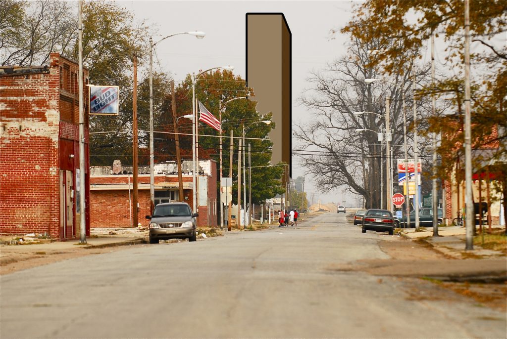
One of the principal goals of this more nuanced analysis is to see different towns & regions more on their own terms, rather than in opposition to some imagined ideal. What are the specific characteristics, cultures, histories, assets, and needs of a place? Once its truer self comes to light, we may be less likely to propose outlandish, inappropriate alterations to a place that relate little to the context. To put it analogously, building a skyscraper in Luxora, AR (pop. 1,033) would not meet the needs of the place, its corner suites and rooftop bars and skylobbies remaining vacant for decades.
Ultimately, shaking off the shackles of the urban-rural divide leads to a richer understanding of our communities’ place in American society. Who depends on us, and upon whom do we depend? How are we contributing? What is our relationship to the natural world and to technology? What stuff is the place made of? What are our priorities for the future? I welcome any efforts to neutralize partisan politics. Fortunately, there are already some folks who are undertaking the pragmatic rebuilding of American towns, most notably Charles Marohn of Strong Towns. His approach is quite simple, based on each town’s reality on the ground, leaving room for the denizens that make up the place be the authors of their own revival, rather than letting cartoony notions of themselves dominate the way they grow and live. I highly recommend exploring the movement. Perhaps even an analysis such as the one I attempted here may be of use to it!