How do you win a design competition? Stand out, right? Present ideas and illuminate things unique to your proposal, right? Don’t trod the beaten path?
What do most of us think of when we think “architectural competition proposal”? We think of a single building, viewed from about one hundred feet, with a clear sense of massing, materiality, and light. Just look at 95% of the submissions for Guggenheim Helsinki, for example. Whenever we design a building, it would make sense for us to design only a building, right?
Not necessarily. Not when you remember that the deeper reason for building a museum or a theater is to benefit the city at large– it needs to draw people inward, and strengthen the sense of place outward. However, that part is always really hard to design, so architects just dabble in it. Using their usual tools, they suggest the potential ways the building at hand will serve the community. This is where the cognitive break happens. There is no way a single architect can know in advance how a civic building will affect its city, especially not with simply arranging walls or choosing materials or even controlling pedestrian flow. Greater forces are at play here, and there is no shame in admitting that we cannot know it all in advance. Architects should see their schematic designs and competition proposals as mere catalysts for further discussion with the operators of the institution, those who make a civic building the living entity it should be after its construction. I’m talking about curators, donors, superintendents, administrators, performers, artists, security guards… the lot.
In order to approach a building design like this, obviously one has to do more than draw. One has to gather, question, talk, and listen.
H3 took this very approach in a recent competition for the University of Auburn, and sadly it backfired. In short, the university was seeking a design architect to lead the construction of a new Performing Arts Center. Each of the shortlisted firms were to fly to Auburn, set up shop in a private room for 4 days, come up with a proposal, then present it to the board and donors. During those 4 days, members of the public were allowed to drop in and interact with the architects, in what was intended to be a very transparent and engaging competition. This charrette-y approach was the idea of university architect Jim Carroll.
Here is a dispatch from Auburn while the charrette was ongoing.

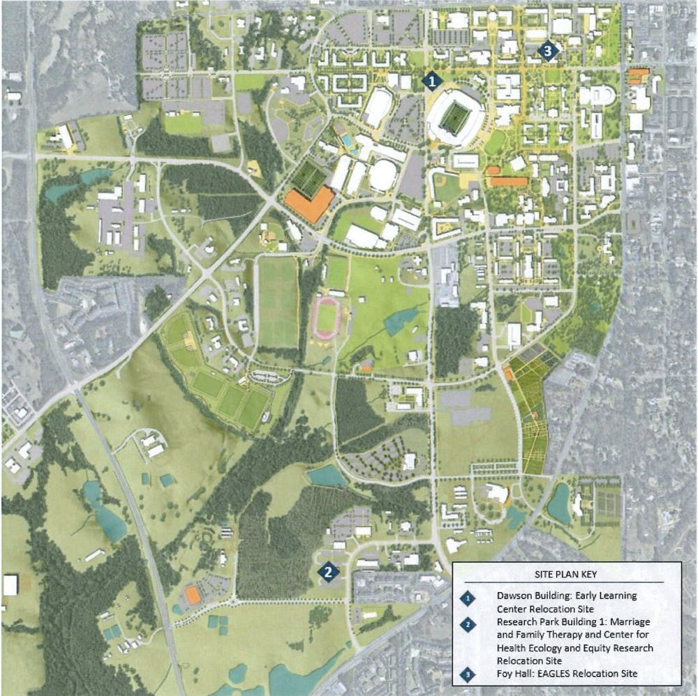
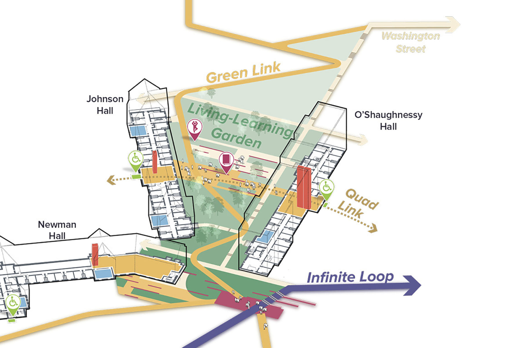
H3’s team, upon arriving at the university, were on the lookout for opportunities and needs on the school-wide scale. Their proposal focused as much on master planning and event programming as it did on the new PAC itself. To convey these big, long-term ideas, they used a mix of site plans, rendered perspectives, physical models, flow charts, diagrams, and even video interviews.
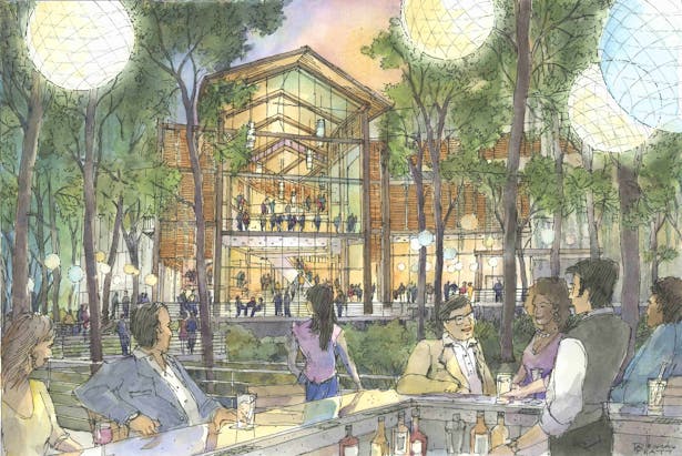
Wilson Butler, the eventual winners, focused fully on designing a building and drawing the audience in with specific architectural details like a large operable door, wood balconies, and a ceiling with a specific lighting scheme. Their deliverables consisted mainly of smaller-scale 3D models, plans, and hand-drawn perspectives.
H3HC’s proposal looked something like this….:

…while Wilson Butler’s proposal looked something like this:

H3’s proposal stood out among the four submissions, without a doubt. They were the unofficial crowd favorite by a large margin. And yet, they didn’t win. Which personally hits a funny bone– on the one hand, they did absolutely the right thing, by focusing on how the building would improve campus life on many fronts;but on the other, by having a less concrete one building in their proposal, they were making a gamble. How can a proposal that gets at the heart of the matter be the odd one out? Shouldn’t all the proposals have considered the big picture?
My recent post about the conversations we have with our surroundings is about the crux of this very matter: the need to balance large-scale, community-based, long-term planning with more human-scale, short-term phenomena that are relatable to each individual in a community.
Humans are each capable of perceiving patterns, forces, systems, and physical qualities of the world that affect us daily but are hidden in plain sight. Mostly, though, we do not seek them out because we are busy with our personal affairs. Further, even if we did seek them out, we would not know where to look. Visions of these patterns must be coaxed out.
The strength of design lies with revealing and ameliorating the issues that we experience every day but may feel powerless to change. But for the same reason that it pervades everyday life so thoroughly, the methods for illuminating it need to be kind of amorphous. A designer needs to use many different media in order to properly link the issue at hand and the people it affects. This is all to say that sometimes (more often than you might think), taking the default path to a design solution is lazy. That laziness is exactly the same criticism usually leveled at architects.
Coming to the first round-table discussion with a design already set is a dick move– it says to the client “you don’t know what’s good for you. I know what kind of building you need here.” Is that the right way to design? But, if we as architects acknowledge how little we actually know in the grand scheme of things, we might then find peace with our drawings. Our raison d’etre then becomes simply space making, which is a deliciously vague idea, but is still mostly understood and allowed by non-architects. But is space making enough? Isn’t space just the white noise on the radio of everyday life?
I’m beginning to generalize, but the frustration was palpable in the conference room when the partners recapped the ordeal. Fortunately, the takeaway is twofold: 1) that H3 will continue to stick to its guns, and 2) those guns are standard issue that for some reason almost no one else wields.
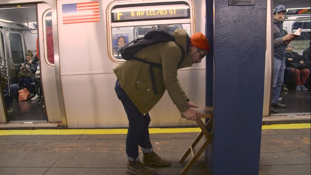
My buddy Chat Travieso is an exception, and constant inspiration. He seems immune to the laziness.
