Tod Williams Billie Tsien Architects On Slowness.

Using Tod Williams & Billie Tsien’s outlook on architectural practice as an opening chapter, you could write a whole book about the importance of treating yourself right physically, being present in the world around you, in order to improve your work. Architects always wax philosophic about “the body in space,” and yet we spend 90% of our time sitting in chairs. Unless we can consciously treat our bodies well (and connect that to the way we run our offices), our license to discuss others’ should be revoked.
The thesis of the book would be that the best experiences of architecture by architects take place during times of physical activity. Times like:
- Jogging through the park at dawn.
- Site walk-throughs.
- Taking the stairs to your walk-up apartment.
- Going to the dog run and conversing with fellow local dog owners.
- Bicycle-commuting over a bridge.
- Traveling to a foreign city, walking around for 6 hours.
- Standing while drawing.
You can imagine the body as a largely unused vehicle. A deep-sea vessel that only gets used for snorkeling. A turbocharged V8 engine that never goes above 40mph. At the very least, you should try to keep the joints well-greased. The more moments of physical activity you can insert into your working day at the architecture office, the better. At the Bauhaus, students dedicated time before class to stretch and meditate. I imagine these warm-ups were quite tai-chi or yoga-esque: not strenuous, but using minute shifts to invigorate the muscles. The practice was closely tied to the school’s love of dance.
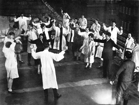

Frank Whitford’s book Bauhaus (Thames & Hudson, 1984) mentions Johannes Itten’s forcing students to stand in order to loosen their bodies.
Two of Itten’s exercises were especially important. The first required students to play with various textures, forms, colors, and tones in both two and three dimensions. The second demanded the analysis of works of art in terms of rhythmic lines which were meant to capture the spirit, the expressive content of the original. Before attempting such exercises the students were asked to limber up their bodies and minds by physical jerks, controlled breathing and meditation.
Alfred Arndt remembered attending Itten’s Vorkurs on his first day at the school. Itten made the students repeat their ‘Good morning’ to him but ‘thought that we were still sleepy, cramped. “Please stand up. You must loosen up, get really loose, otherwise you can’t work! Turn your head! So! Still further! Your neck’s still asleep…”‘
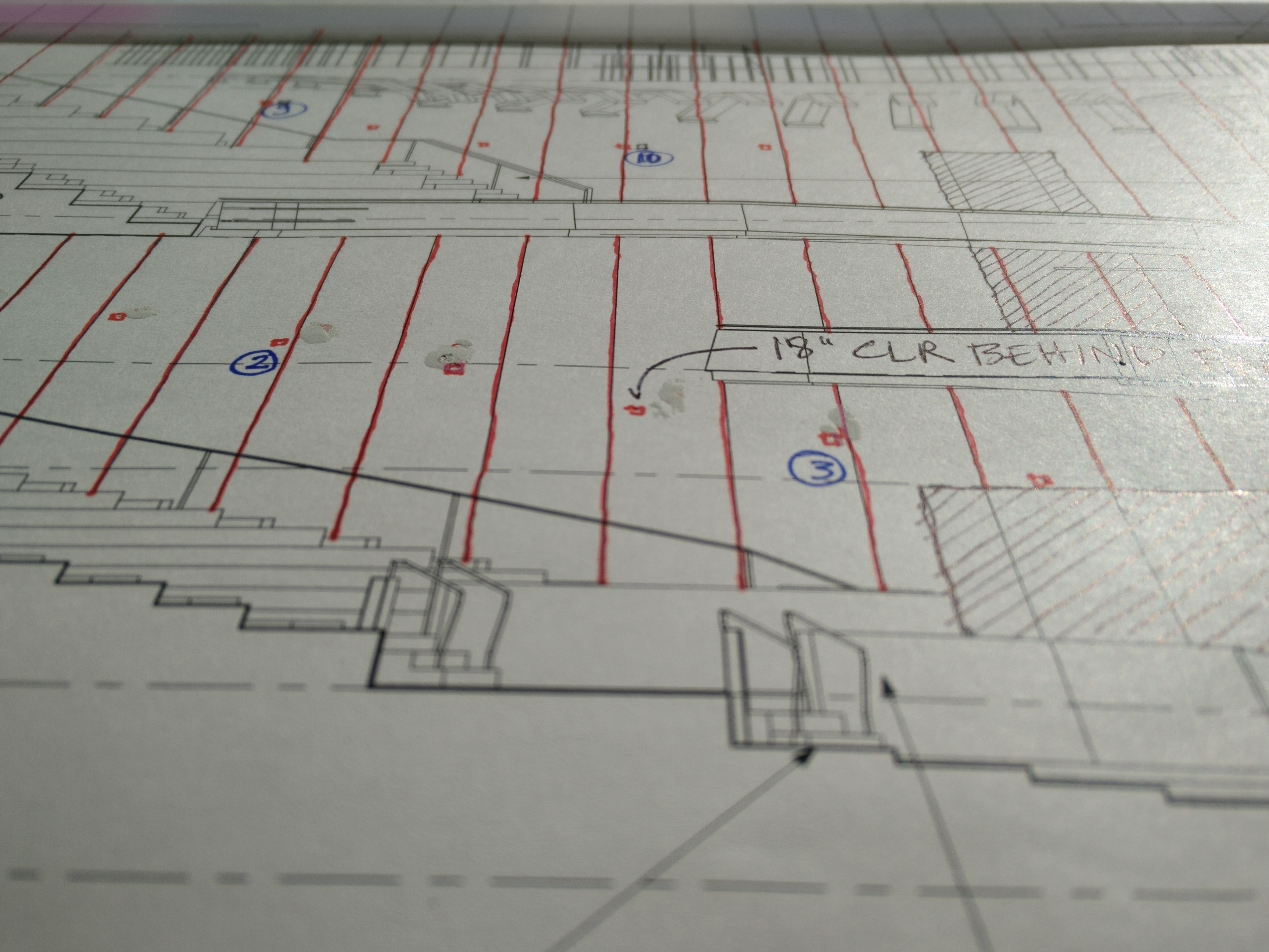
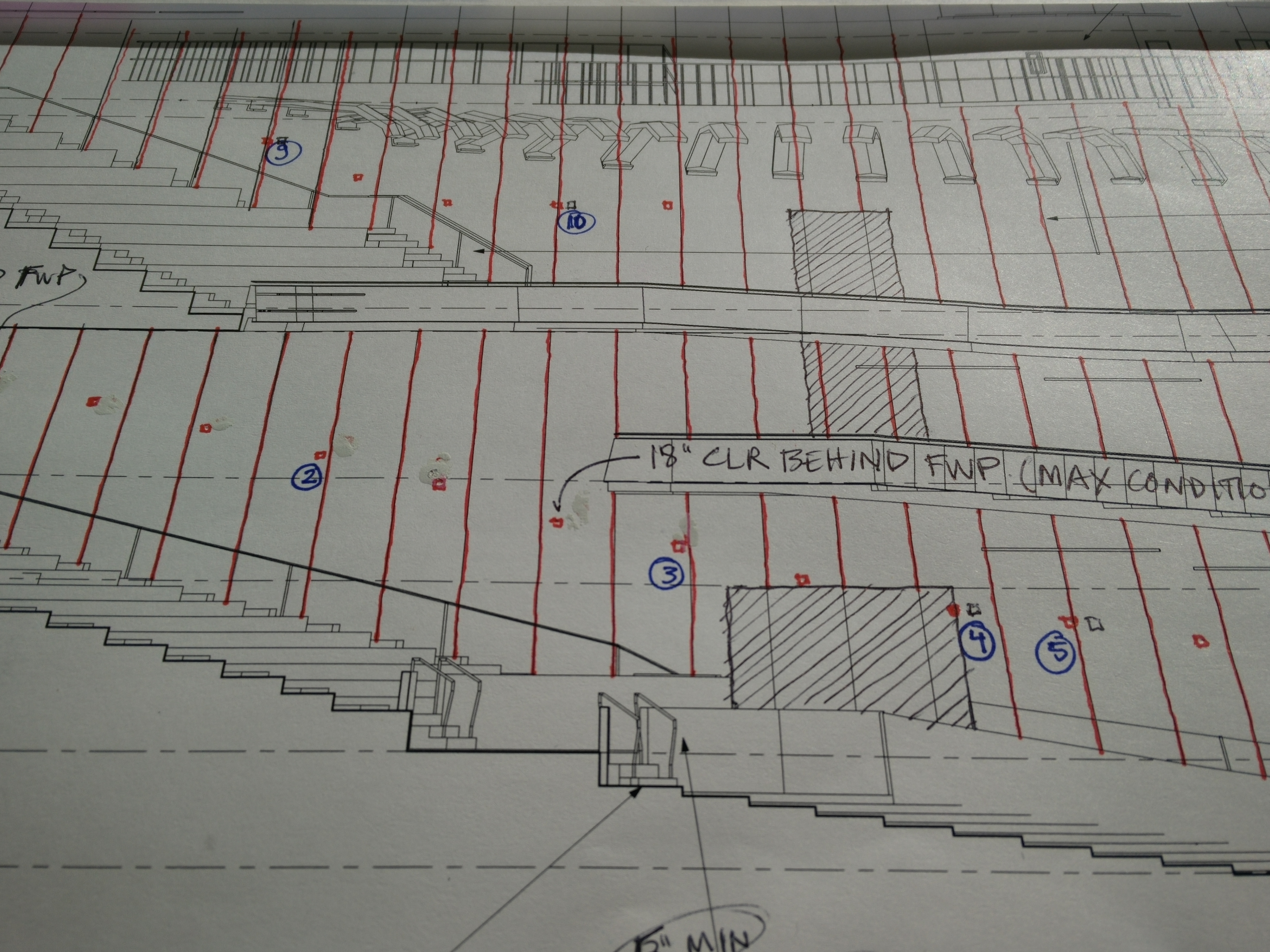
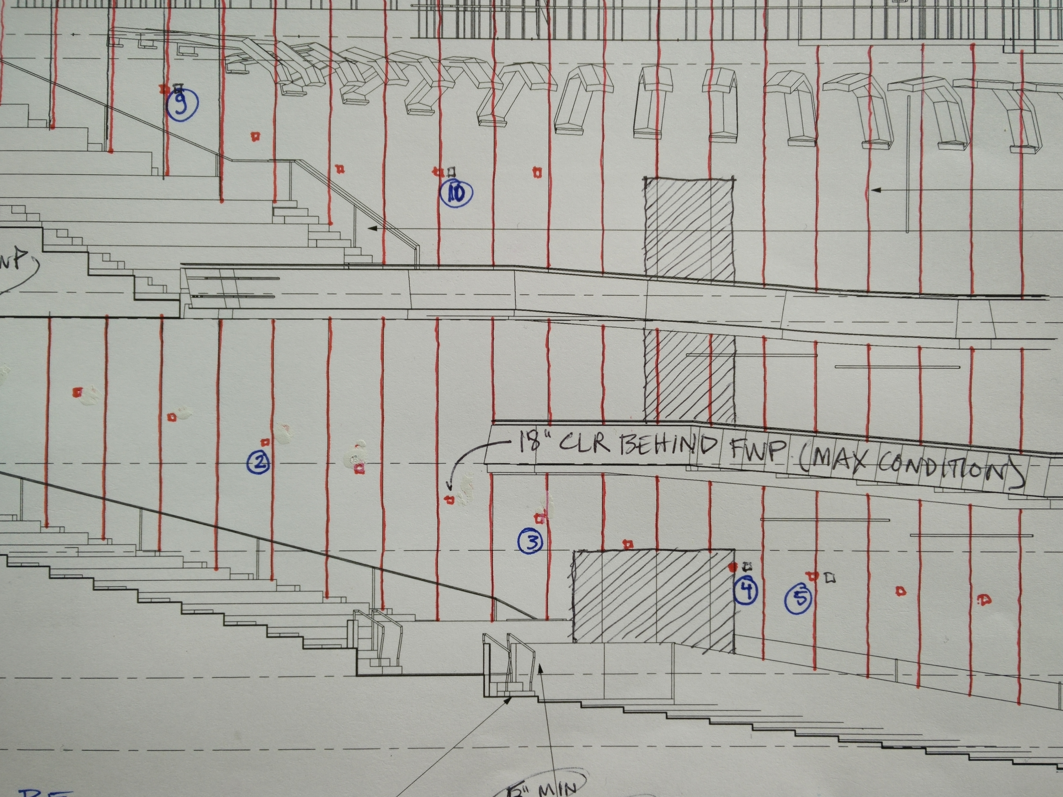
Going deeper, I realize that our whole paradigm for architectural representation is linked to standing. Plans, sections, and elevations are artificial views of buildings which are never actually experienced but which are 100% better at carrying information about how to build. They are orthogonal projections, that is they collapse all of the points, lines, and surfaces of a building onto a flat plane: e.g. a piece of paper or a computer screen. And ideally, to preserve that flatness, I have to position my eye perpendicular to, and centered on, the surface. But if you consider the way we sometimes work– seated at a desk, with the drawing facing up to the ceiling– that perfect position is impossible.
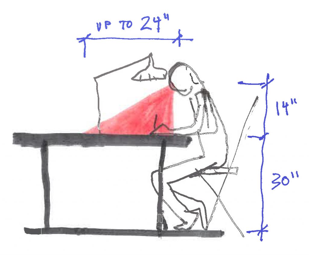
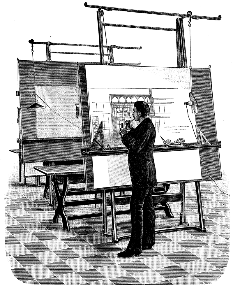
In a way, working like this is an ineffective hybrid of old-school ergonomics and new-school drawing techniques. Look at the way old-school architects draft: on a vertical or slightly inclined table, standing or sitting on a tall stool.
Then look at how new-school architects draft: seated in an office chair, 3 feet in front of a computer screen. Both of these satisfy the perpendicular-viewing rule that preserves the accuracy of our drawings. But if we want to keep blood flowing as Johannes Itten demanded, slow down as Tod Williams and Billie Tsien demand, we have to stand up again. Hoorah for standing desks.
I experienced the same today while sketching a markup of an elevation. What I thought were beautiful receding lines suddenly became parallel!!
