I. Proximity
On a hot Friday afternoon, I was walking downhill toward the Hudson River through the Upper West Side with Alba and Josep, my friends from Barcelona. I was describing the peculiar kind of density found there: the neighborhood is a great example of how even 100 years ago Americans were able to build as densely as they do nowadays, even without glass boxes.

Another thing that’s pleasant about the Upper West Side is that in spite of the solidity of the buildings, their bulk rising straight up from the property line with few giveaways to public space, and the inherent privacy one expects from residential neighborhoods, the sidewalks still feel alive. We could hear knives chopping, children shouting, and pianists practicing. I told Alba and Josep that I remember having the realization as a child that in New York City, and most metropolises, no matter where you are or when it is, you are never more than twenty feet away from the nearest human being. They may be behind a wall or on the floor beneath you, but they are always near.
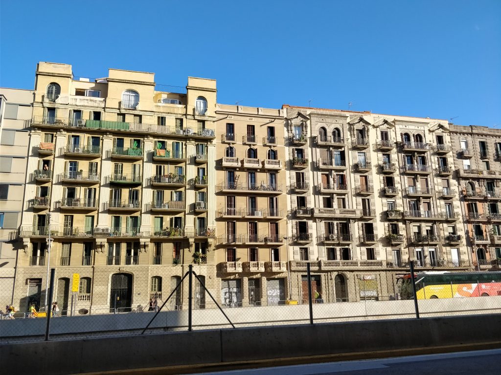
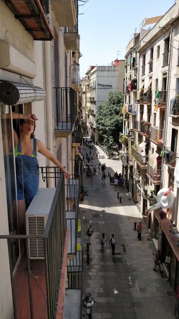
The Catalans agreed. In Barcelona, even into the 21st century, people hang their clothes out to dry on clotheslines. You see independence flags strung out on balconies of the newest apartment complexes. In cities, other people are like family members in a large house. They are off in other rooms doing their thing, but signs of their presence are everywhere, and subconsciously you know that were you to call out, they would come.
Let’s crunch some numbers. You spend 8 hours a day in your 10-foot-wide apartment, which shares a wall with your neighbor, so your neighbor is approximately 15 feet away from you during that stretch. Your commute is 30 minutes each way, during which you are most likely squished onto a crowded train and the distance to the next person is 1 foot. Including the slightly less-squished time walking to and from the train station, let’s slacken that 1 foot to 3 feet. You sit at a desk in an office for 8 hours, during which, according to industry standards, a comfortable distance between coworkers is 5 feet. That leaves 7 hours of free time in the evening– let’s assume you spend 3 of those at a restaurant or a bar with friends, and the other 4 at home relaxing. At restaurants and bars, the next closest person is sitting slightly closer than in the office, so let’s approximate 3 feet. And at home, we’re back to 15 feet. So let’s calculate the average, split out by hour:
(15 feet x 8 hours) + (3 feet x 1 hour) + (5 feet x 8 hours) + (3 feet x 3 hours) + (15 feet x 4 hours) = 232 feethours;
232 feethours / 24 hours = 9.66 feet
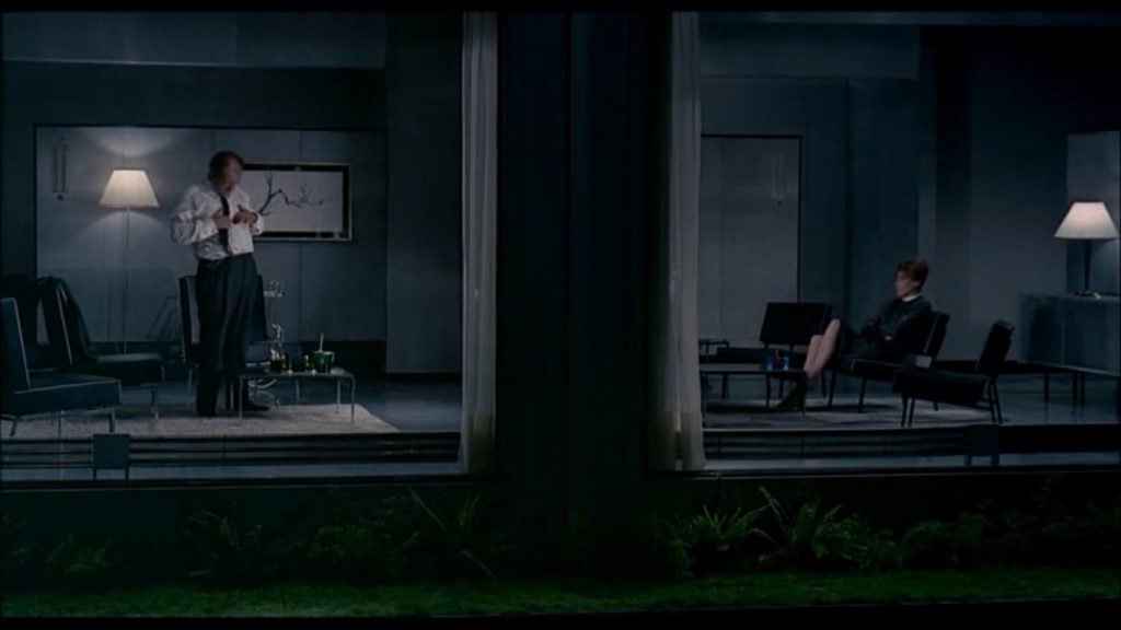
So, on average, over the course of a typical work day, you are less than 10 feet away from the next nearest person. Jacques Tati captures this fact perfectly in a scene from his 1967 film Playtime, in which a man undresses in his living room while a woman watches TV in the next apartment. We cannot see the TV itself, making it look like the woman is watching the man. Meanwhile the camera is watching both of them from outside, turning the whole scene into an absurd voyeuristic striptease.
Speaking of voyeurism, Alfred Hitchcock’s Rear Window (1954) is build on the tension between privacy and society (side note: how strange is it that even though private and public are always placed opposite each other, it only works when they are adjectives. Change them to nouns and the balance breaks. Privacy and publicity? That’s not quite right. I chose society there, though it doesn’t fit perfectly. There ought to be a solid, reliable noun for publicness).

That image of a couple relaxing on a fire escape brings me to the topic of living facades.
II. “Vertical Sprawl”
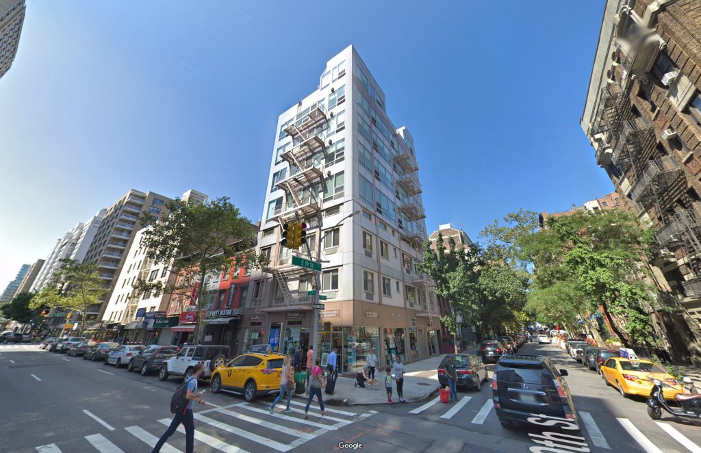
On my bike route to work, crossing 3rd Avenue, I happened to look up one day. I saw a building which surprised me: 220 3rd Avenue, at the southwest corner of 19th Street in Gramercy. It was a modest apartment building with about 8 stories, clad in subtly shiny metal panels, and on the front facade was something that surprised me. A fire escape!
My surprise requires a bit of explanation. Fire escapes have been obsolete for decades. One hundred years ago, they were important stop-gaps for a persistent fire problem in cities that were exploding in size. How to safely and rapidly egress people inside of a burning building without sacrificing valuable rentable square footage? The solution was a metal stairway attached to the outside of the building. But quickly, it became clear that these things introduced more problems than solutions. They corroded, they couldn’t hold too many people at once, and, to the ire of landlords and regulators, residents inevitably began appropriating them as gardens, storage, and private patios. Finally, New York City declared it illegal to build any new ones in 1968. The Atlantic has a great short history from 2018.
That means that any fire escapes you see around you are surviving from at least the late 60s. But that baffled me even more– this building, with its shiny metal exterior, must have been renovated recently. So how could a building’s facade be completely renovated without disturbing the clunky metal stair attached to it? I began imagining the complicated legal game of twister the building owner must have played to get approval for the preservation of this fire escape while everything around it gets renewed. Perhaps it was worth it. Looking at the building, I frowned trying to imagine the building without the fire escape. It would have become a jarring, barren, monotonous block. It would have been devoid of visual detail. It would never have caught my eye, and I would have felt one fraction less connected to my city.
All of us move through the city in this way. We make eye contact with others, we peek into windows, we read signs. Our eyes instinctively seek out clues which give us information about our surroundings. In a place as complex as a city, that need to know what’s going on around us is even more important. Whether it’s quotidian (when is the next train coming?), banal (a dog pooped here), dangerous (that car is not slowing down for the red light), educational (judging by the statue, this building was built in 1888), or an opportunity (the sign reads “buy one get one free”), everyone strives to connect to their city using this thick web of informal data. Facades of buildings are a prominent piece of that web, and even though they’re not strictly public space, they exact a strong influence on how we know our cities.
In this sense, the fire ecape’s swift transition into an ornament is a boon. Let them continue to be used as sculptures, as photographers’ darlings, as tanning salons and reading rooms.
In every nefarious regulation there’s a kernel of good intentions, and in every useful regulation there’s a kernel of nefariousness. Which side does the life of facades fall on? In cities, light and air are scarce, so dwellers take a special pride in their derelict fire escapes. I know I treasure mine. Even though I’m not allowed to, I’ve beaten rugs, spray-painted furniture, smoked joints, meditated, tanned, and chatted the night away with friends on that extra bit of space. Tourists always take photos of our building from below, and I enjoy posing for them, providing the human scale that upgrades those photos from good to great.

Ironically, fire escapes were no longer being built in the 60s. Image uploaded by davidcallidae, via Flickr, license CC BY-NC-ND 2.0.
Even The City of New York is aware of this topic. The Department of City Planning publishes numerous reports and studies– such as this one called Active Design: Shaping the Sidewalk Experience from 2013 (when Michael Bloomberg was Mayor and Amanda Burden was City Planning Commissioner). On multiple occasions, it discusses how facades should feature more architectural details and that massive, bulky buildings should be broken down.
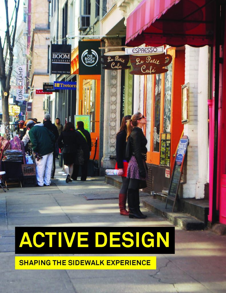
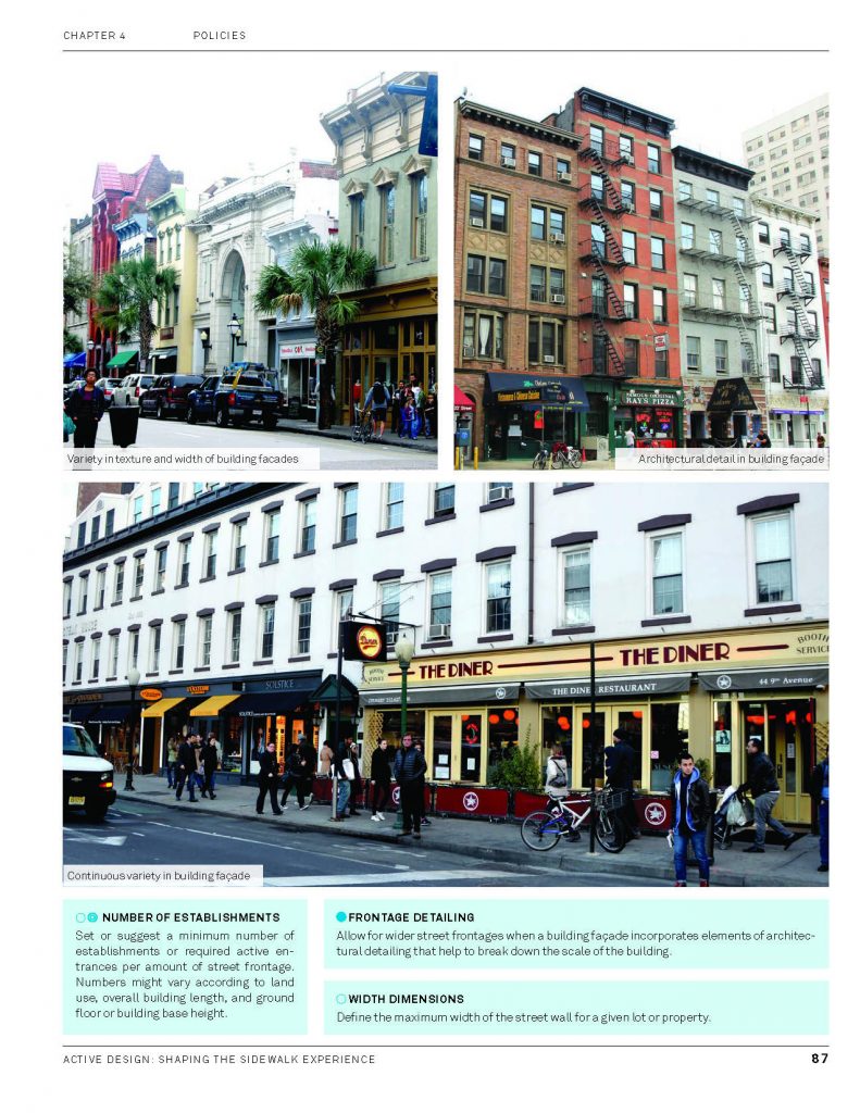
Page 87 of Active Design: Shaping the Sidewalk Experience, talking specifically about detailing facades.
Providing an increased level of detail in the lower portions of the building facades, breaking down the massing of larger developments, and allowing for a variety of speeds and types of activities, can ensure that the sidewalk space is engaging for the pedestrian.
Chapter 5: Summary; page 108
Articulation (architecture): The method of styling and physical manifestation of a building. In this document, it refers to the façade detail, which adds visual interest, depth, and character. These elements contribute to the walking experience and help maintain the pedestrian’s interest.
Glossary; page 110
Balconies: Unenclosed platform extensions that project from the wall of a building, with a railing along their outer edges, often with access from a door or window. Activities on these upper level balconies can contribute to an animated, lively façade.
Glossary; page 110
Fire Escapes: Structures used to escape from a building in case of an emergency. They are usually metal stairways located along the outside walls. Beyond their functional purpose, fire escapes add a sense of rhythm and texture to the building façades.
Glossary; page 111
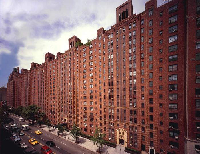
New York is trying to avoid are the hyperdense, hyperhomogenous vertical fields buildings you often get from 1,000 feet above. Take most American downtowns, Sao Paulo, or Hong Kong, for example. The basic unit that composes a 20th century downtown is the skyscraper, which is a product of 19th century technology: structural steel, vision glass, and elevators. Industrial processes perfected the production of these three components efficiently and repetitively to create supertall buildings. However, towers that soar into the sky come with a hitch: the higher you go, the more separate you become from the street below, and its informal data web. Who occupies the top floors of skyscrapers? Usually, it’s those who benefit most from being insulated from society. I’m talking about corporate CEOs with corner offices and billionaires with penthouses. I shouldn’t have to stress too much the need for rich people not to become too separated from their communities and cities (in short, I think the American Dream narrative is missing one last step: giving back), but I will say that it’s important for our buildings to express that unbreakable bond more clearly.


.jpg?1375395768)
We are all familiar with the term “urban sprawl,” which describes outward, horizontal growth of cities (and the dull neighborhoods it creates), but there should be a term for vertical urban sprawl, in which faceless towers sprout like mushrooms and create a dull urban environment even in the heart of downtown.


III. Greenify, Screenify, Humanize
There are three general directions that most architects take when trying to design an active, living building facade.
1. Make it green. Most people, when they think of “living facades,” think of green facades, thick with grasses, ivies, flowers…. The benefits of adding more plant life to buildings is well-known: reducing the urban heat island effect, absorbing stormwater runoff, providing habitat for animals, and more. Aesthetically speaking, they also are pleasant to look at if well-maintained. There are studies that show that the appearance and movement of plant life lives in the perfect middle-ground between order and randomness, which, when looked at, stimulates the brain in a healthy way, much more so than watching a screen.


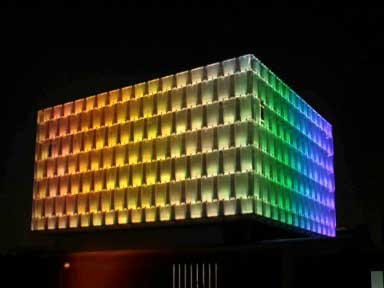
2. Screen-ify. With the advent of screens and pixels, any large surface can be turned into an active, responsive light show. Many buildings have taken advantage of this by demonstrating things like: a university’s research in real-time responsiveness (changing the color of a facade based on various dynamic inputs); programmed light shows just for entertainment or outdoor events; a single color on a stadium to indicate who is playing at the moment; the possibilities are endless. Are these stimulation enough? Do they provide enough activity and interest in the surrounding city? So far, this young technology only behaves like an enlarged screen, but its hypnotic draw is undeniable.

3. Humanize. There’s no substitute for human life. Allowing people to use their little piece of a building’s facade the way they wish is a microcosmic analogy to city-making as a whole: the challenge is to establish a framework, a structure, a skeleton, within which people feel enough freedom to control their own destinies. It is a difficult balance to strike. To wit: give too little space, and life rebels by spilling out onto it and restricting utility (in the case of the fire escape); give too much, and you end up with barren balconies, walkways, and rooftops (in the case of the Nemausus housing project by Jean Nouvel).
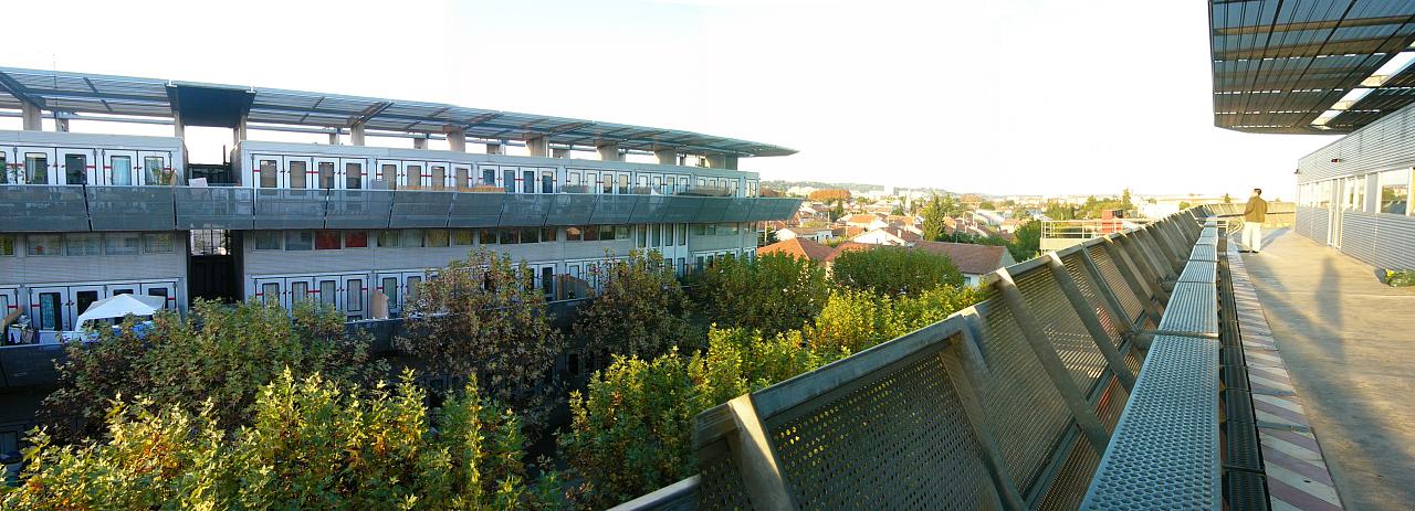
You will notice I began writing automatically about balconies. But they are just one example of how a building’s public face may be made more human. It may be as simple as a clothesline or a flag. It may be even just a few touches of (ornamental) detail. Both of these things require a combination of designer’s purpose and inhabitant’s will. It cannot be simply a given. It isn’t enough to give a balcony to a resident; the resident must feel pride in that small privately-owned public space, or at least the will to use it regularly. Be it for storage, even: as their fellow citizens walk the streets below and look up once in a while, they can’t lose sight of people.
