Every time we pass Spain’s most famous building, we have something to say.
“La Sagrada Familia. More like La Sacada Familia. La Chingada Familia. La Putada Familia.”
“It looks like someone bought one of those nozzle attachments for cake icing and decided to just try all the settings.”
“There was a time when you had one of everything: one spire, one entrance, one rose window… and they were special. This thing has SIX rose windows. On this side alone.”
“It’s melting.”
“It’s exploding.”
“Are they ever going to actually turn it into a cathedral once it’s done? Or would they rather keep making money? Because right now, it has no purpose. It’s just a monument to itself.”
“It’s like the Pepperidge Farm Bread of Catholic cathedrals. You finish it, and it still ain’t finished.”
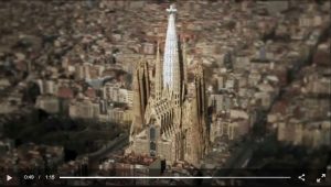
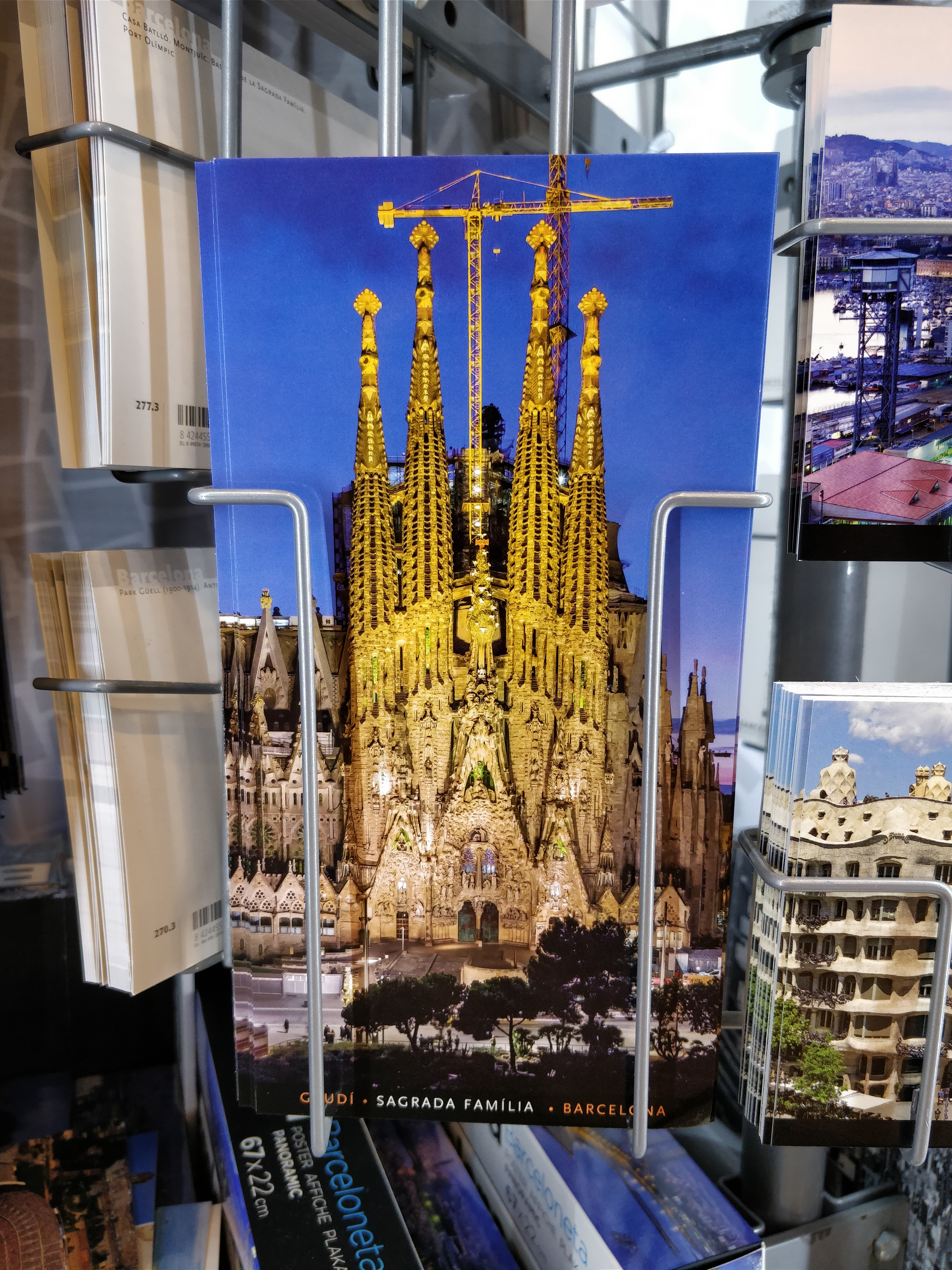
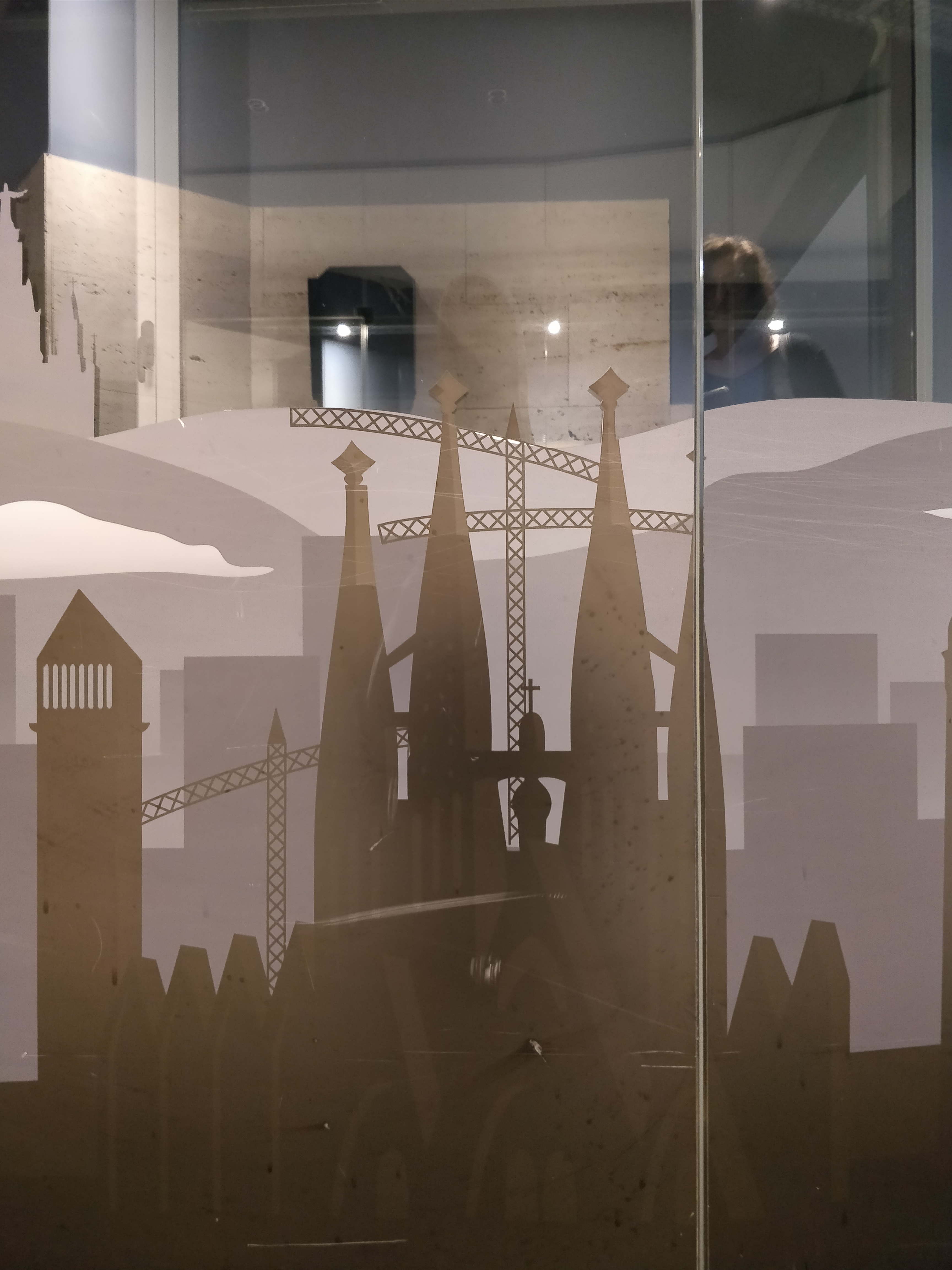
“The construction cranes have now just become part of the building. Another style in the eclectic mix.”
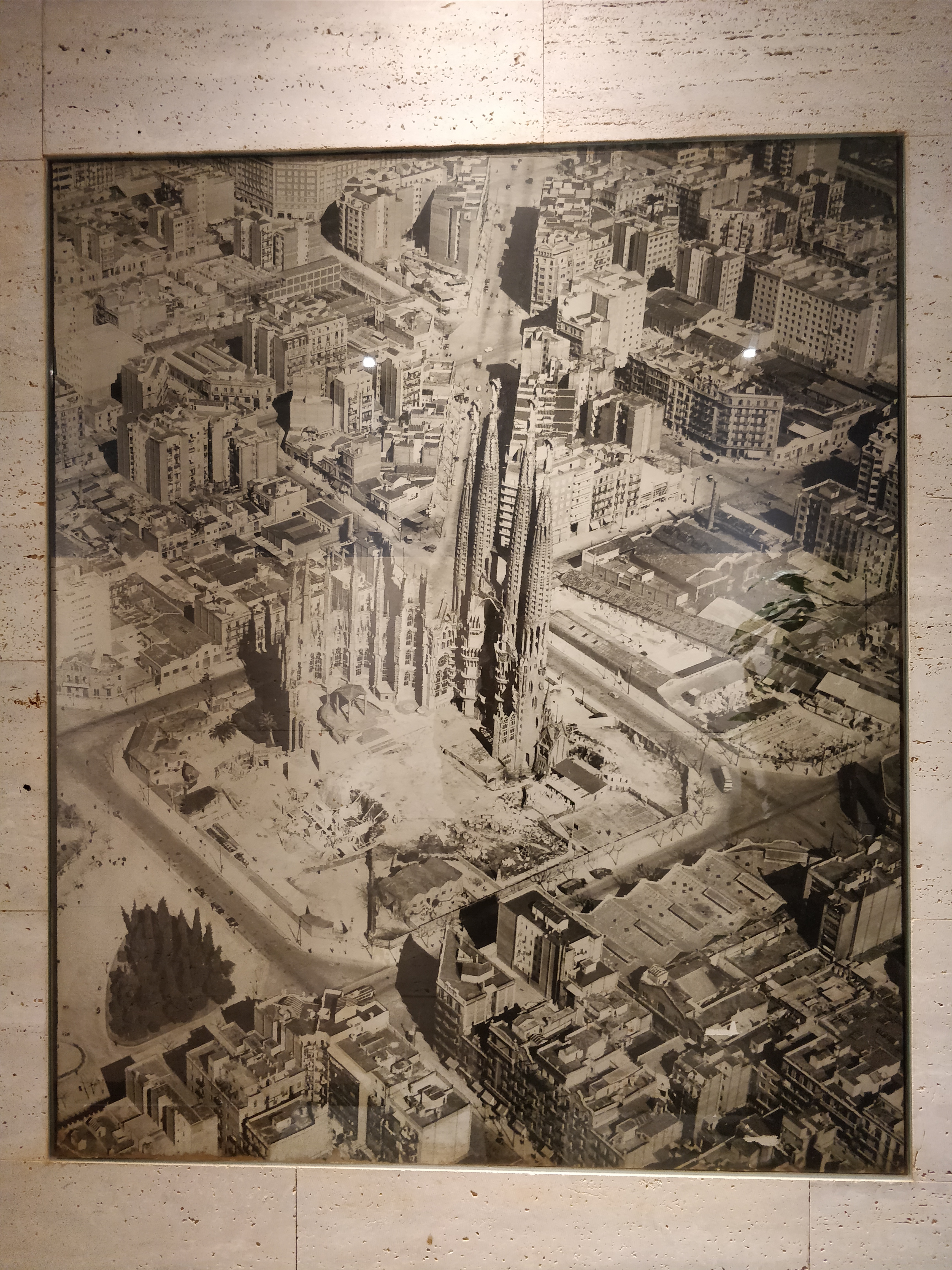
This last one was my favorite. We wrote these down in a private place because we knew the world would scoff at us for not appreciating one of its wonders. Criticizing La Sagrada Familia sometimes feels like ordering tea at a bar: you won’t be rebutted logically, you’ll be overruled dictatorially. I had accepted this. But then, I noticed something: in many of the depictions of the cathedral in postcards, advertisements, and graphic designs around the city, the cranes were included! Most interestingly, in graphic designs. I wasn’t taking for granted that just because they were photographs that the cranes had to be there, since photoshopping has now become such common practice that a company with enough enthusiasm for La Sagrada Familia would take the extra time to spiff an image of it up by removing the cranes. So why have some artists chosen to remove the cranes, and some chosen to include them? Is this project a monument? A folly? A cathedral? The contradictory contours of Spanish pragmatic melodrama are briefly illuminated.


One reply on “La Sagrada Grúa”
The cranes look like crosses, very appropriate.